
16 Ancient Egyptian and Egyptology Fonts
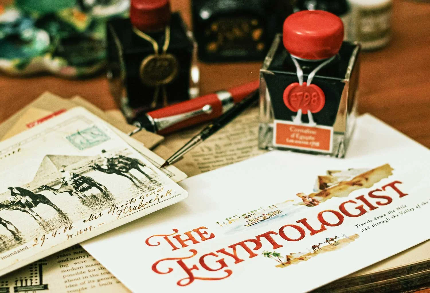
An illustrated card I painted using J Herbin’s specialty 1798 ‘Cornaline d'Égypte’ (Egyptian Carnelian) ink.
Ancient Egypt vs Egyptology…
Setting up a collection of fonts that evoke the spirit of ancient Egypt was not as easy as putting together the set of 21 Medieval fonts I did the other week.
For one thing, they didn’t really have a font back then. They did have writing - Hieroglyphic, usually just for sacred texts, Demotic used as an everyday script for the Egyptian people, and Ancient Greek, the language that was used by those who ruled the country at the time of the stone’s creation.
However, I think when most people imagine a typeface for ancient Egypt, it’s more likely influenced by films, posters and product packaging from the past, but much more recent history.
That’s why I’m calling this post Ancient Egypt and Egyptology fonts vs just Ancient Egyptian fonts. These are fonts I believe would work for a movie, book cover, poster about Ancient Egypt- yes - but even more so for adventurous or romantic stories starring an Egyptologist.
In the 1920s, when King Tut’s tomb was discovered, for example, there was Egyptomania all over the world. Pyramids, sphinx and lotus motifs were highly prevalent on everything. And because this was in the 20s, the fonts that were used at that time still have a connection to what we think of as an Egyptian font, in a cinematic, ‘Egyptologist involved in a mystery or fantastic discovery’ sort of way.
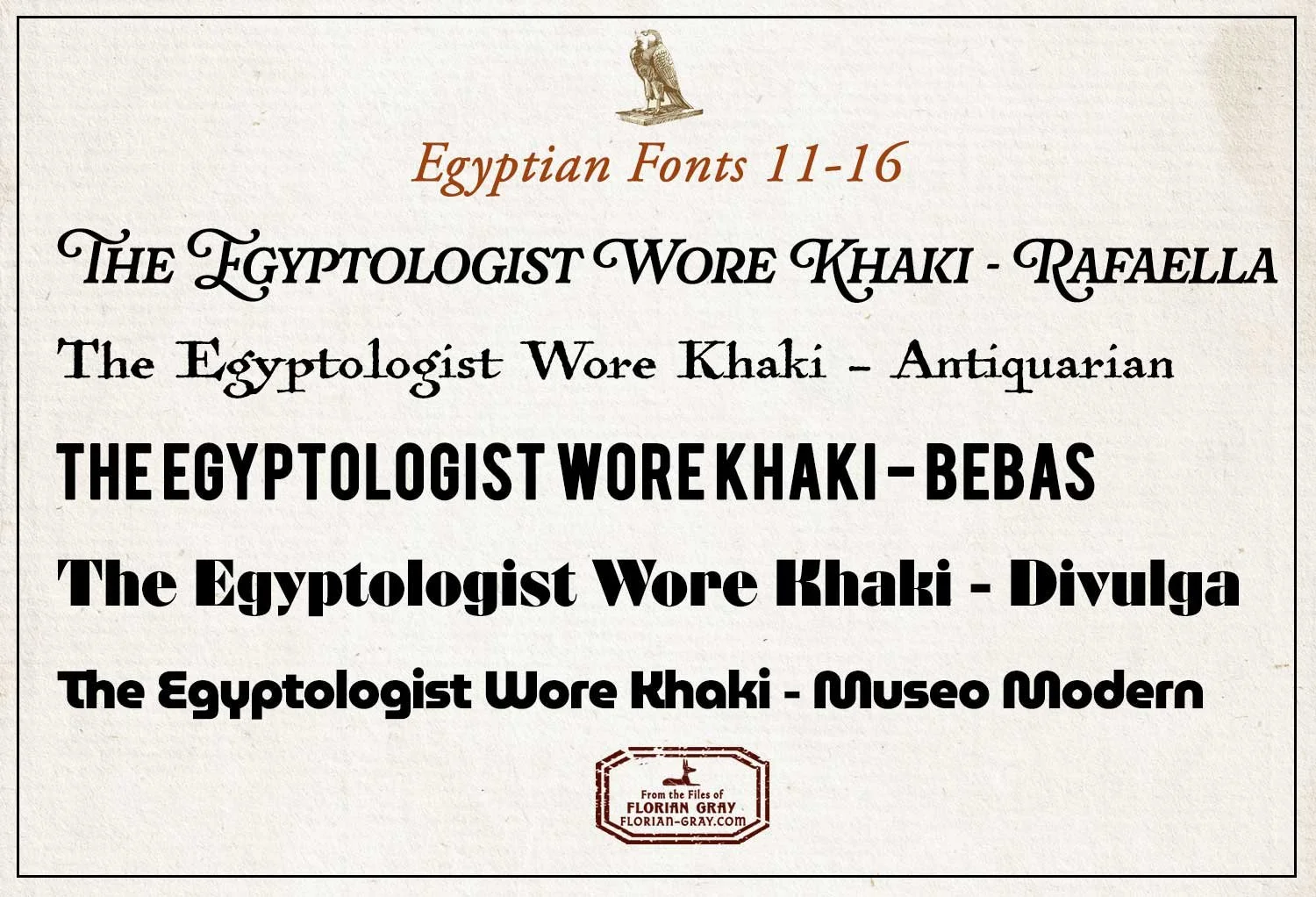
The first five sets, depicting ancient Egypt and Egyptology in both antique and modern fonts.
From Antiquarian to Mod 70s Egyptology Fonts…
But that’s not true of every font.
In the ones I’ve collected above there are other factors as well - some look antique and slightly rusticated - the second one, Antiquarian, has the grainy look similar to the ubiquitous Papyrus font (which I refuse to include in this collection because it’s so over-used, imo).
The first font, Rafaella, is the one I used on the card I painted in the first photo. It has ‘sweeping’ swashes for caps that evoke a vintage, globe-trotting Egyptologist.
The third, Bebas, is a very blocky font that reminds me of the kind of type that was used in old storefront signs on an Egyptian back-alley street.
The last two fonts have a 70s feel, even though, Divulga (4) also reflects the Art Deco period. The last font, Museo Modern, makes me think of Robert Redford in safari clothes and aviator glasses, sipping a glass of mint tea while surreptitiously spying on two men, one man passing an envelope of money to the other.
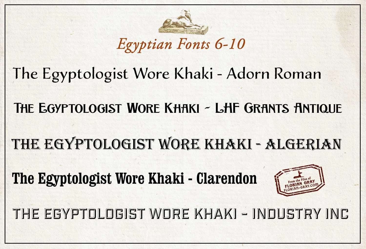
Egyptian Fonts Set Two…
The first font, Roman Adorn, would work well as a body text font, for paragraphs and longer writings vs a fancier display font.
LHF Grants Antique is the one I use on my logo header. It has the whimsy of the curled serifs but the blockiness of a vintage font from the late 1800s. It says Victorian Egyptologist to me.
Algerian, the third font, just evokes that part of the world, and Clarendon is another font like Bebas, from the earlier set, that is a bold typeface but this one has a slab serif.
The last font on this card, Industry Inc, is font that reminds me of old painted storefront windows, usually in gold on glass. Sometimes a little dusty, the kind of place you might find black market antiquities for sale in a back room, through a door of hanging beads.
Practical, Whimsical or Quirky…
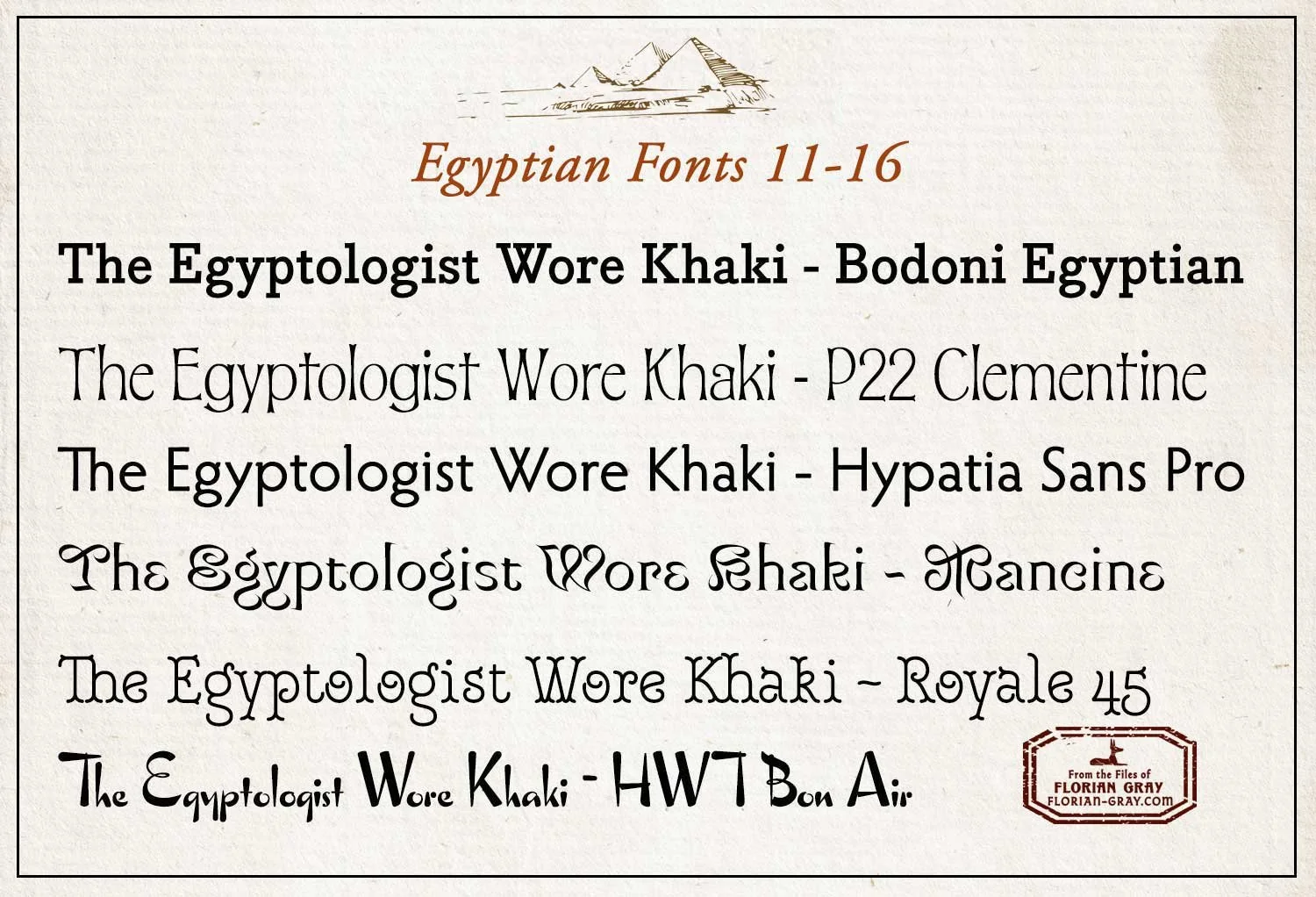
This last is a mixed set of straightforward, whimsical and quirky.
The first font, actually has Egyptian in the name, and again this boldish font has the traditional slab serif ‘chiseled in stone’ kind of look often seen in typefaces depicting Ancient Egypt and/ or Egyptology.
Hypatia, the third font, is similar but without the slabs and lighter.
The second and fourth fonts are both designed with a bit of whimsy. They’re decorative and cheerful, yet there’s something in them that says Egyptology to me. With the Royale 45, the curliness reminds a bit of Arabic writing - but the one above it, Mancine, even more so.
Lastly, there’s HWT Bon Air, this one also reminds me of Arabic in a calligraphic sense. The weight changes in the stroke give it a handwritten, almost painted look. I’ve used this one with a digital watercolor effect and it turned out really nice.
And that’s it, my collection of Egypt and Egyptology fonts.
If you enjoyed this post, you might also like my post on the Ancient Egyptian Color Palette.