Herbin French Inks
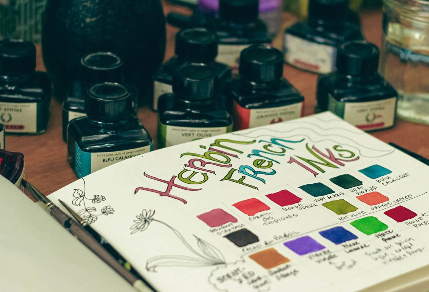
My palette of the Herbin inks I have in my collection.
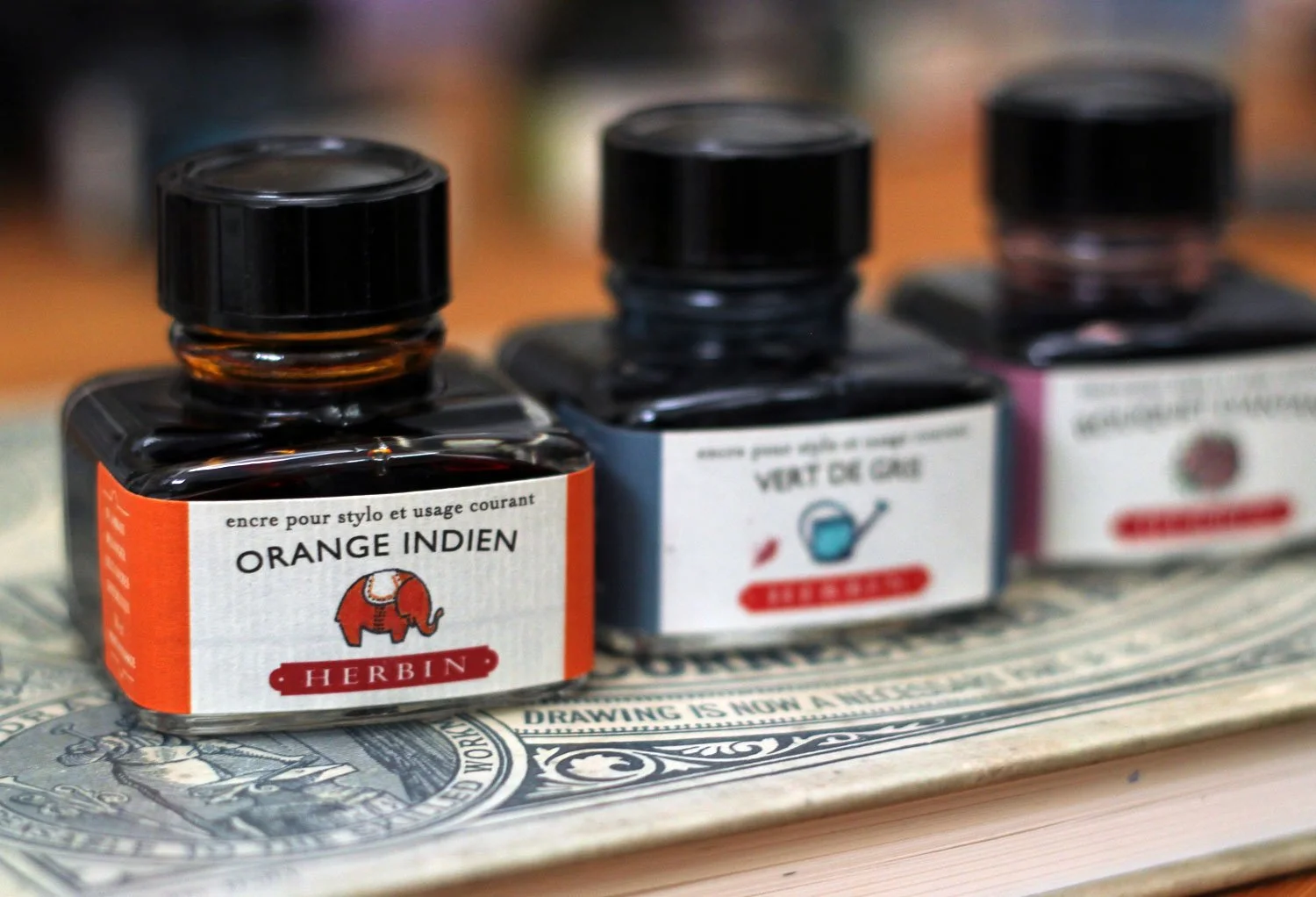
Charming Bottles and Label Design…
As a graphic designer, one of the first things that caught my eye when coming across these were the charming labels on the classic 30 ml bottles. Each one has a small illustration beneath the color title that coordinates with the color.
I also love the fact that the labels are on laid paper, my favorite.
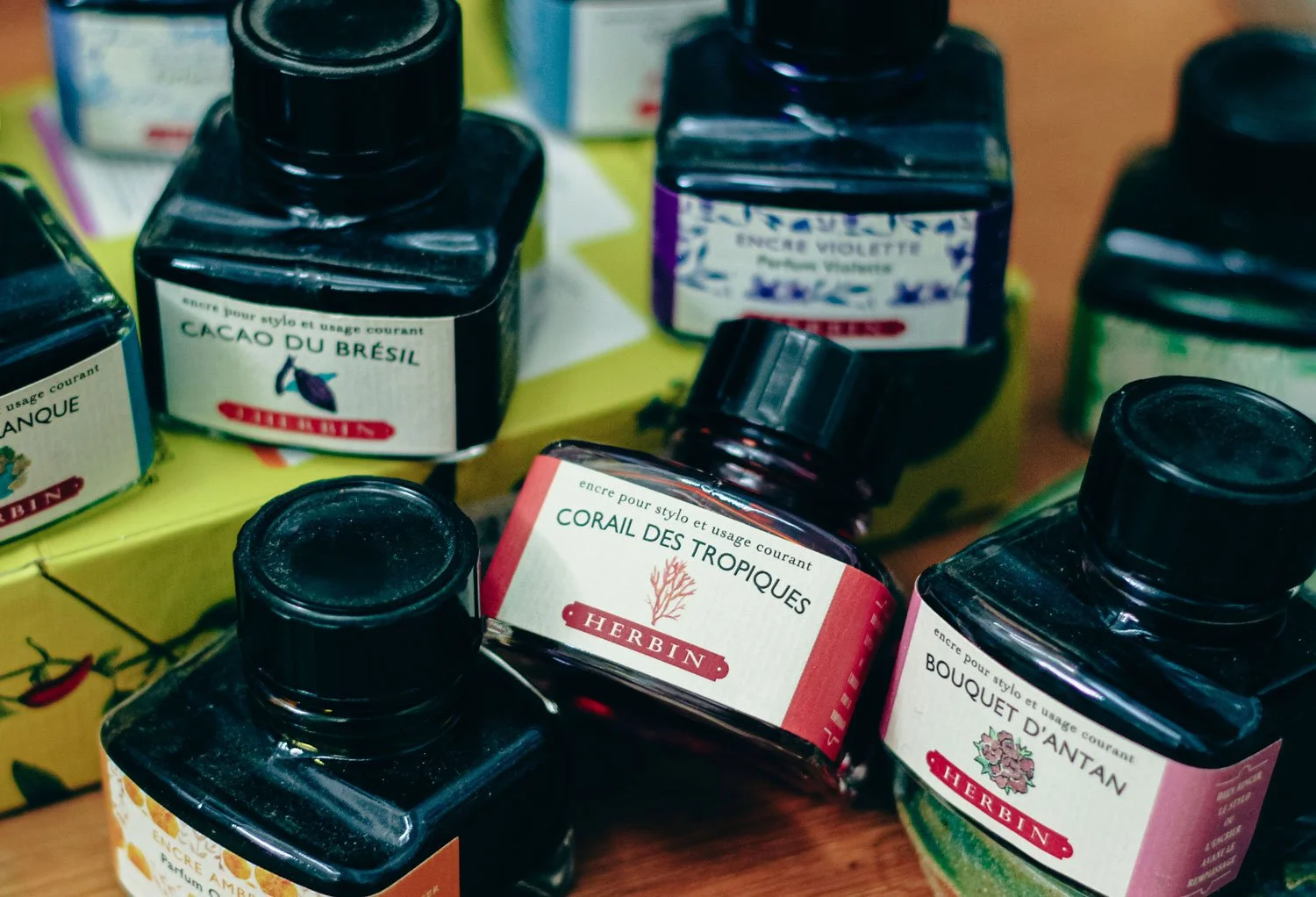
J. Herbin writing inks with charming labels.
A Beautiful Array of Colors…
But enough about the labels.
I am someone who loves color charts. If you visited the Greeting Card section under my ‘Shop’ link you’ll see that I have a whole set of cards with historical color palettes on them. But I also like making color charts for all the art supplies that I buy too.
So, I thought I would start sharing some of those, beginning with J. Herbin inks.
Technically, these are writing inks, however, I use them for illustrative painting and decorative lettering too.
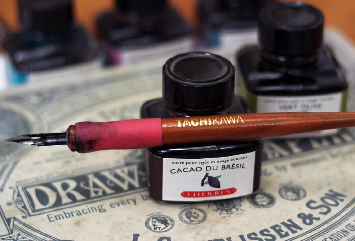
The bottle with built-in pen or brush holder.
A Built-In Pen Rest…
I forgot to mention that this particular bottle size has a convenient place to rest your pen or brush. There’s a small horizontal indent at the top.
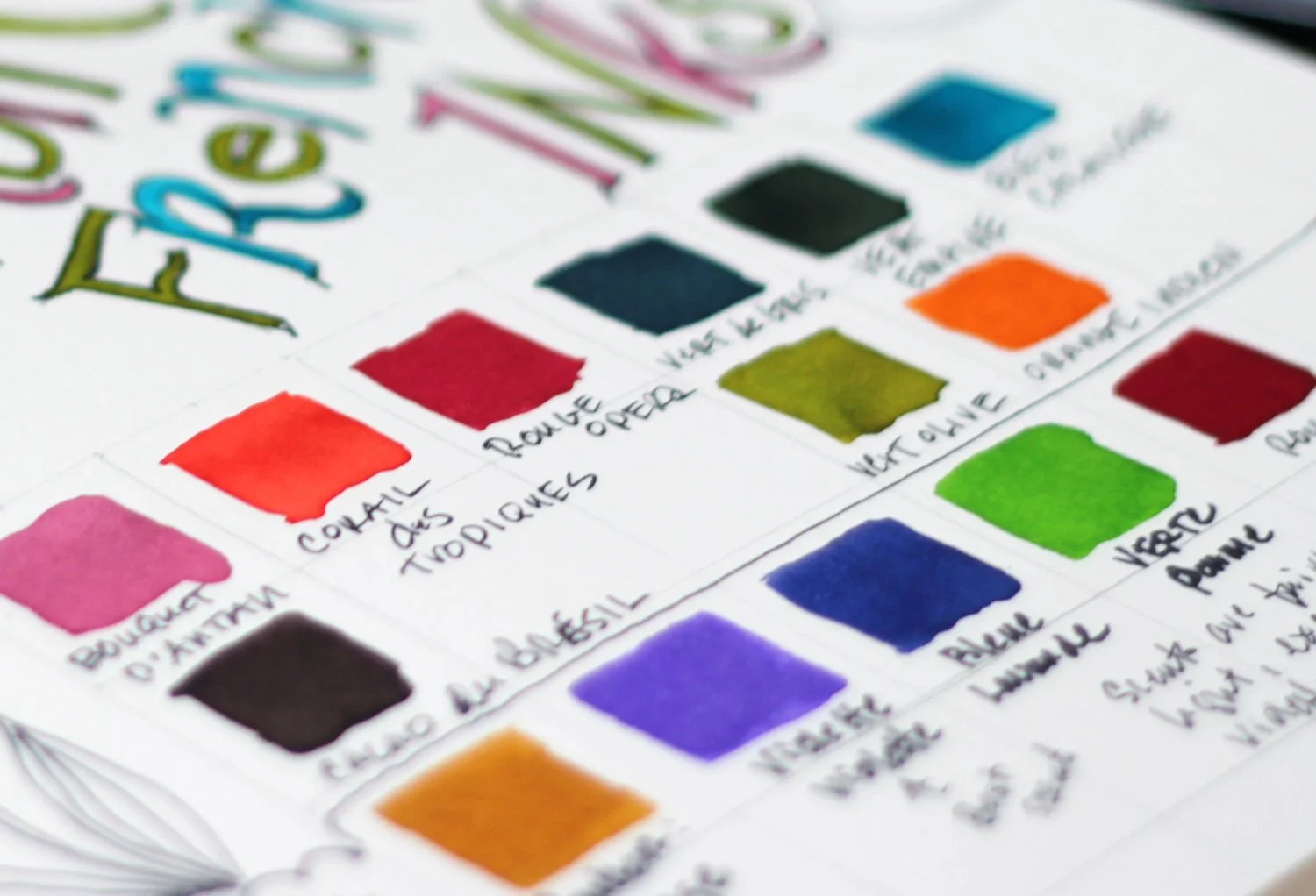
The colors are bright and vivid. The ones that I’m showing on my DIY chart may look a bit more intense as they’re shown in a block of color vs. if you were writing with them. In that case, with just lines of written text they appear a little less concentrated.
Bright and vibrant color!
Some Inks are Scented…
On the above chart, the five colors on the bottom, are scented. There’s Amber with an orange scent, Violette with a violet scent, Dark Blue with a lavender scent, Green with an apple scent and a deep Red with a rose scent.
The smells are not terribly strong, the Violette and the Rouge being the exceptions. And even those are not overwhelming. The scent of the other colors was less apparent. If I didn’t know what they were supposed to smell like, I don’t know that I would have guessed them correctly. That said, all were pleasant.
I went back to see if the scent held on the paper later on, and again, the Violette and the Rouge were the winners.
The labels on the Herbin website are slightly updated from these, but still have the illustrations:)
Some of My Favorite Colors…
My favorite colors of the ones that I own are the Bouquet D’Antan (I google-translated this and it was ‘Bouquet of Yesteryear’ or something to that effect), Vert Empire - a dark, forest-y green that I love - especially for writing, and Vert de Gris, a gorgeous indigo color, not, like what you might think of as the turquoise verdigris on copper.
While most people use these in pens or for calligraphy, I often use them with a brush in abstract art work or when I’m messing around with decorative lettering.
I have so often tried my hand at calligraphy and I have so often failed…but at least the colors and ink are nice when I do.
Visit the Herbin website here.